Verified charts: a specialist that checks every number
Preview (since 0.7). The first specialist: a small model proposes, code checks against the source, code renders. The promise is narrow on purpose: every number drawn is quoted from the text, with its unit and scale; what does not verify is not drawn and the report says why. Beauty is not promised, and the pairing of a label with its number is the proposer's (a warning says when the label's words are not near the number).
Chart makers and LLMs get numbers wrong: a swapped digit, a share that was never in the text, a percentage drawn as a
count, a pie of answers that add up to 108%. solvi.charts turns a text into an SVG chart in four steps — the contract
of every specialist (solvi.specialist.Specialist):
- propose — a proposer writes a typed
ChartSpec(pydantic): the chart type (bar,line,pie), a title, a unit and a scale, series of labelled values, and for every value the passage of the text it was read from; - check — deterministic code verifies each value against the text (below); what fails is dropped, changed or
flagged, each with a reason (
Issue: severity, code, message, path in the spec); - render — deterministic code draws an SVG from the verified values only (same verified spec → same bytes);
- trace — the source's hash, the proposal, the check and the output's hash in a hash chain;
replayre-checks the recorded proposal and re-renders it: the same issues and identical bytes, or a list of what differs.
from solvi.charts import chart, ChartSpecialist, LLMProposer

run = chart(press_release, "revenue by region")      # the rule-based proposer, no model
run.output                                           # the SVG (a str), or None when nothing verified
print(run.report())                                  # kept / dropped / changed / warnings, one line each
run.issues                                           # [Issue(severity="dropped", code="unit_mismatch", ...), ...]

llm = LLMProposer("http://127.0.0.1:8080/v1", "qwen2.5-7b-instruct")    # any OpenAI-compatible server
run = ChartSpecialist(llm).run(press_release, "revenue by region")

record = run.to_dict()                               # store it (JSON); the source is kept apart unless with_source=True
ChartSpecialist().replay(record, press_release).ok   # True: the same checks, the same SVG bytes
A proposer is any callable (text, question) -> ChartSpec | dict | JSON: RuleProposer (numbers of one unit, labelled
by the words around them; enough for simple texts and tests), LLMProposer (asks a chat model for the spec as JSON;
standard-library HTTP, the key never recorded), FixedProposer (a spec given in advance: a stand-in, a hand-written
spec), or your own model. A proposer is never trusted and never replayed: its output is recorded and checked.
What the check verifies, for every value:
| check | dropped (code) when |
|---|---|
| a quote | the value has none (no_quote); the quote is not in the text, or not at its start (quote_outside) |
| the number | the quote holds no whole number — "4.2" cut out of "14.2%" does not count (no_number); the number read there is another one (value_mismatch); it is off by a thousand / million / billion from the chart's scale (scale_mismatch); it cannot be read without a guess: "1.000", "3 100", "5 m" (ambiguous_number; decimal="," or "." says which separator the text uses) |
| the unit | percent vs percentage points vs a plain number vs a currency ($ / USD / € / £ / ₽ / руб.) must match exactly; a word unit ("tonnes", "employees") must follow the number in the text (unit_mismatch); a series in another unit than the chart's axis (unit_mismatch_series) |
| one number, one value | the same place in the text drawn twice (quote_reused) |
| labels | a label with a number that is not in the text ("Q1 2027") is dropped (label_number); in the title or a series name such a number is shown as [?] (text_number) |
Numbers are read by the same deterministic parsers as text in: thousands separators, decimal points or commas, scale words ("$4.2 billion", "3 млн", "2k"), currencies before or after ("1 500 000 руб."), percent.
The chart type against the data (the type is changed to bars, never a number):
- a pie only for one series of positive shares of a whole: in percent adding up to 100 (within rounding: half a unit
of the last digit per slice), or adding up to a total the text states and the spec quotes (
total=); a slice that did not verify means the whole cannot be shown (pie_refused); - a line needs two verified points (
line_refused); a point that did not verify breaks the line there; - a stated total that the values do not add up to is a warning on a bar chart (
total_mismatch: parts missing, or not parts of it).
The SVG. Deterministic (fixed number formatting, no clock, no randomness: replay compares bytes) and without
dependencies. The only numbers drawn are the verified values, as direct labels — there is no numeric axis, so no tick
number that is not in the text. A proposed value that did not verify leaves its category with an n/v mark (its
tooltip says "not verified in the source") and the footer counts them. Accessible: role="img", <title> and a
<desc> that states every value as text, a <title> on every bar, point and slice; text at 12 px or more; colours at
3:1 or more against the background and text at 4.5:1 or more. A small layout solver keeps text from overlapping: titles
and labels wrap, vertical bars turn horizontal when their labels or values do not fit, line labels try eight positions
around their point (avoiding other labels, points and the line), pie labels are pushed apart on each side with leader
lines. ChartSpecialist().draw(run.checked) returns the layout too (every text box, the font sizes) for your own checks.
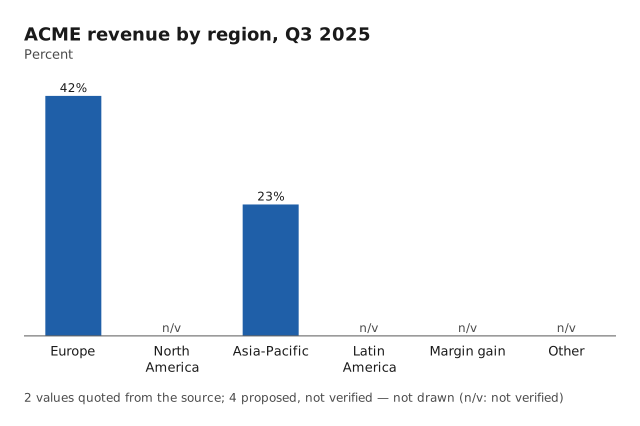
charts 1: rendered · trace 016371c49221
  kept: Europe = 42% (source: '42%' at 206)
  kept: Asia-Pacific = 23% (source: '23%' at 265)
  dropped: series[0].points[1] — 'North America' = 53%: the quote states '35%', not 53
  dropped: series[0].points[3] — 'Latin America': the quote 'Latin America for 7%' is not in the source
  dropped: series[0].points[4] — 'Margin gain' = 3%: the source gives '3 percentage points' in percentage points, the chart shows it in percent
  dropped: series[0].points[5] — 'Other' = 2%: no quote in the source — a value without a quote is not drawn
  changed: kind — not a pie: a slice did not verify, so the whole cannot be shown — drawn as bars
Limits. The check proves that each number is in the text with that unit and scale, not that the label is the right
one for it (a label whose words are not in the number's sentence gets a label_not_near warning) and not that the
chart answers the question. Text width is estimated from a per-character table, not measured with the font, so the
layout is conservative rather than exact. Charts are bar, line and pie, one unit per chart; no stacked, scatter or
dual-axis charts yet. Tables, slides and speech are the next specialists.